CASE STUDY
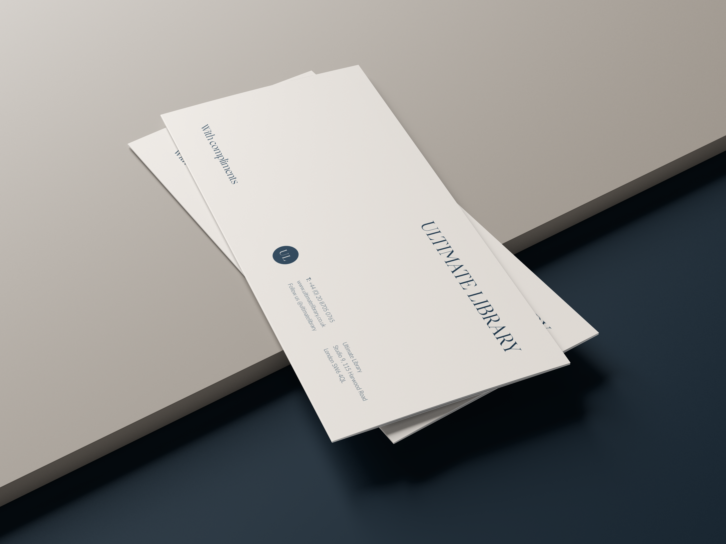
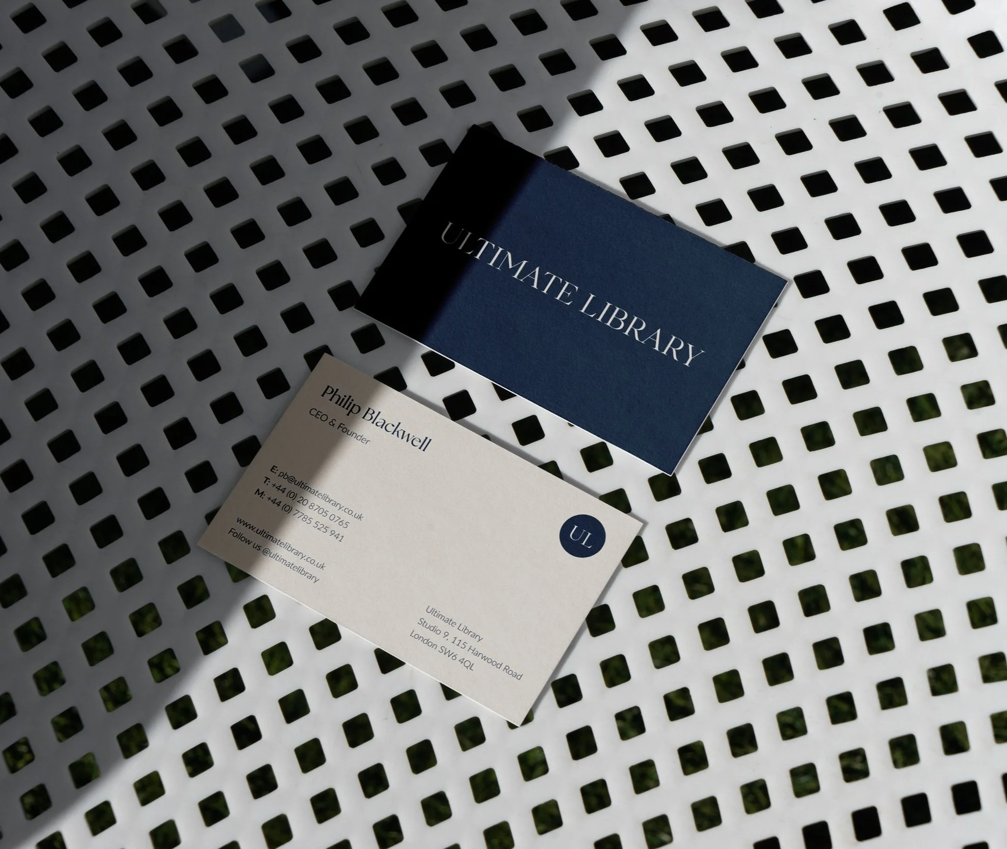
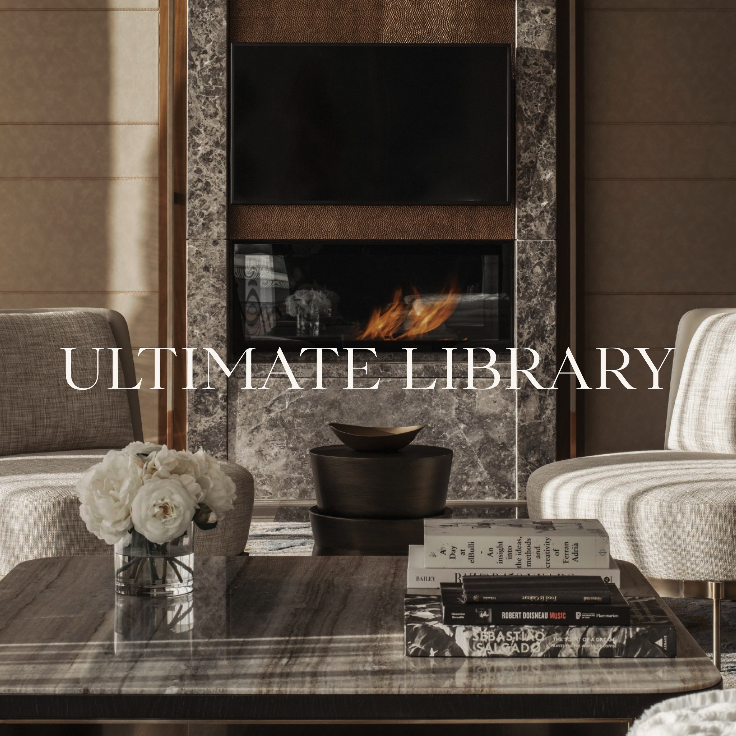
Ultimate Library
About
Rethinking user journeys and branding for bespoke book company Ultimate Library.
Role
UX/UI + Brand Identity + Website Design
Challenge
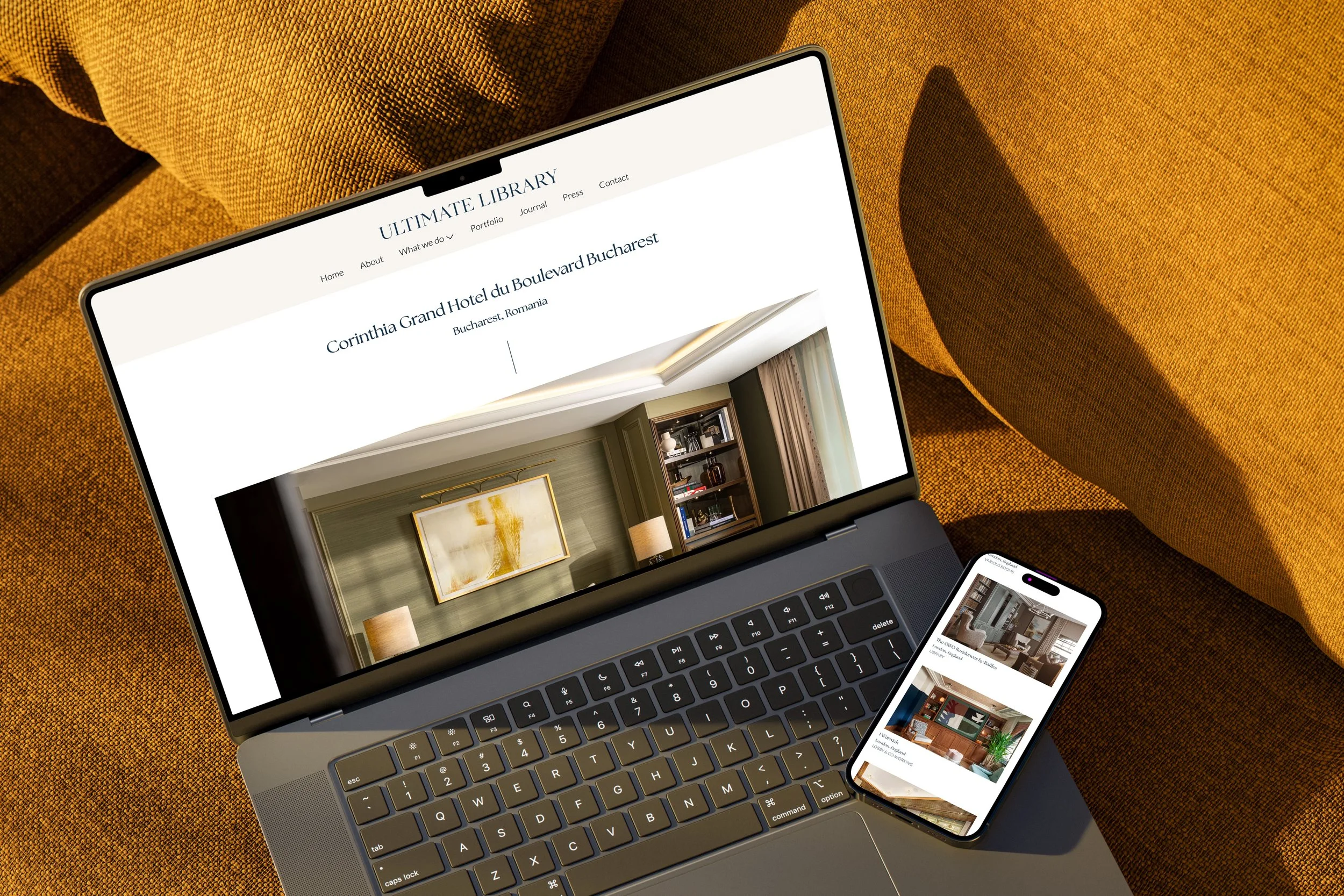
Ultimate Library creates bespoke book collections for individuals and businesses, offering a highly personalised service rooted in literary expertise and curation. As the business evolved, there was an opportunity to bring greater clarity and cohesion to how the brand and services were presented online.
The challenge was to reimagine the website experience to better articulate Ultimate Library’s offering, support multiple audience types and reflect the premium, tailored nature of the service. The site needed to communicate expertise and trust, while guiding users clearly through the range of services and towards enquiry.
Solution
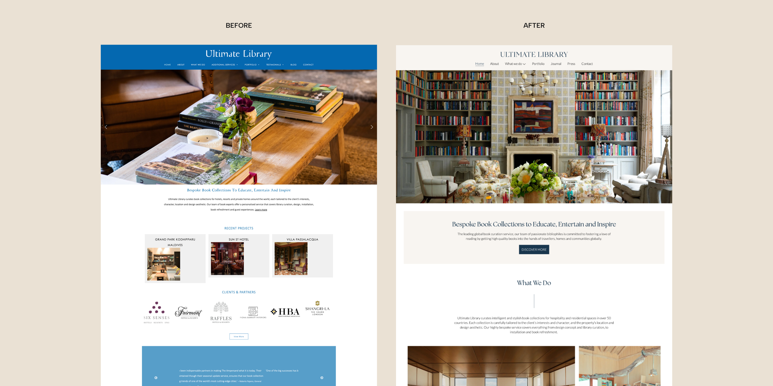
The project began with a UX-led approach, reviewing the existing site structure, content and user journeys to identify opportunities for improvement. From this, a new information architecture and navigation system were developed to create clearer pathways across services, projects and contact points.
The visual direction was refined to feel calm, considered and editorial, drawing inspiration from the world of publishing and luxury print. A subtle colour palette, carefully chosen typography and balanced layouts work together to create a sense of craft and sophistication.
Content hierarchy and page layouts were designed to support storytelling while remaining easy to scan, ensuring users can quickly understand the service without feeling overwhelmed. The resulting website presents Ultimate Library as an expert, premium brand, with a digital experience that reflects the bespoke nature of its work and encourages meaningful enquiries.

Projects
-
![A smartphone displaying a website called DesDeck, promoting web design services, placed on a rock outdoors.]()
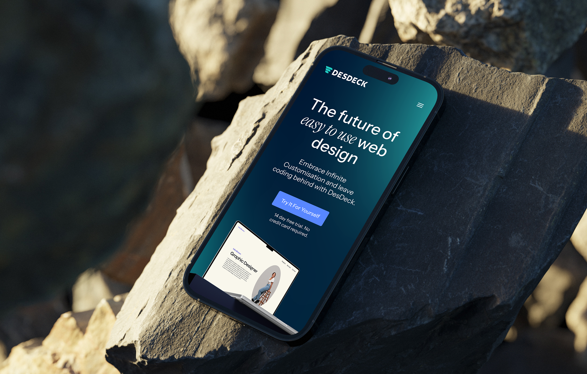
DesDeck platform
UX • UI
-
![A bottle of Genaura Levagen+ Smart Face Serum in front of its yellow packaging box on a marble surface.]()
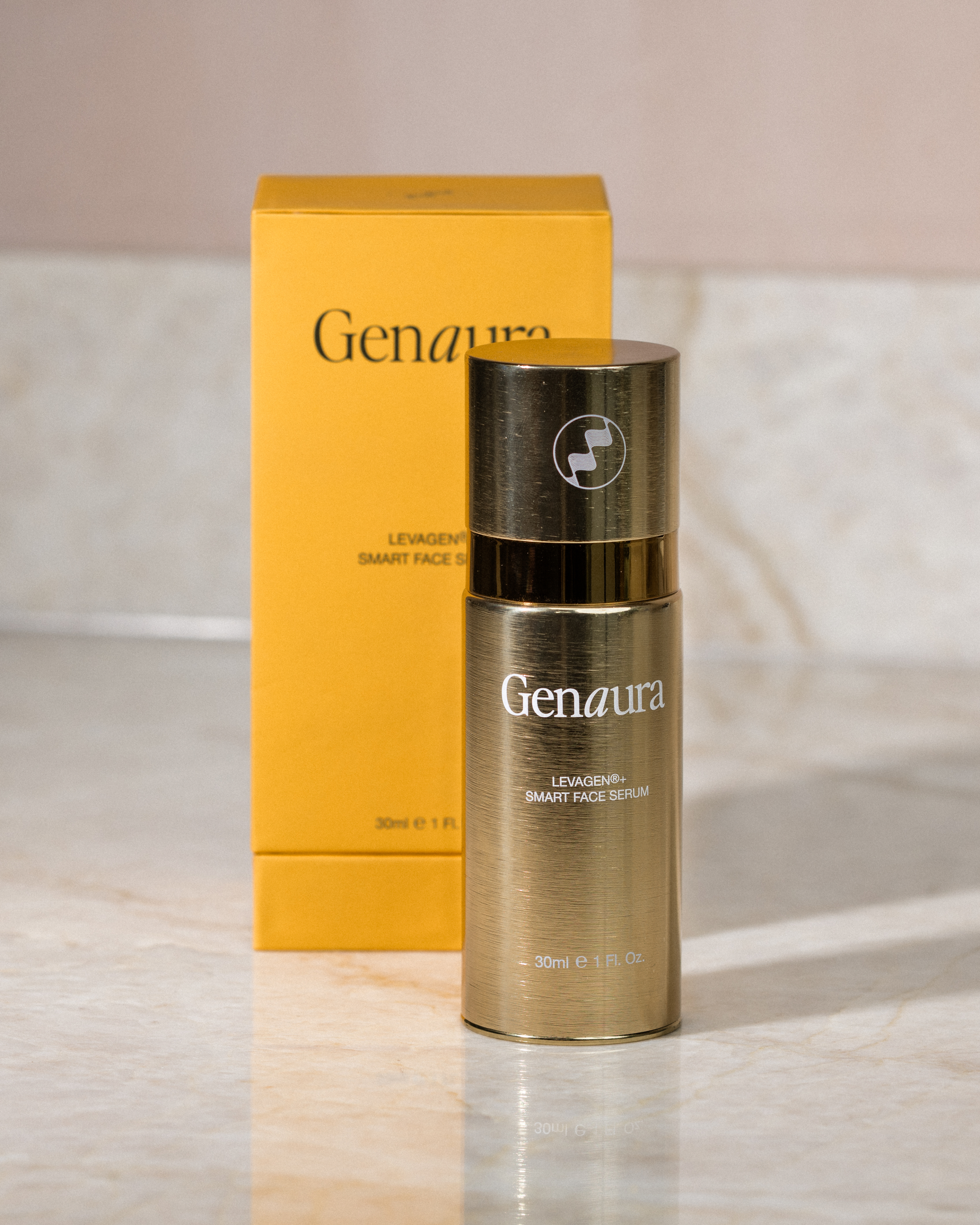
Genaura
Brand Identity • Branding • Packaging Design • Website Design
-
![Two smartphones floating in the air displaying an app related to wildlife and food products, with a green background.]()
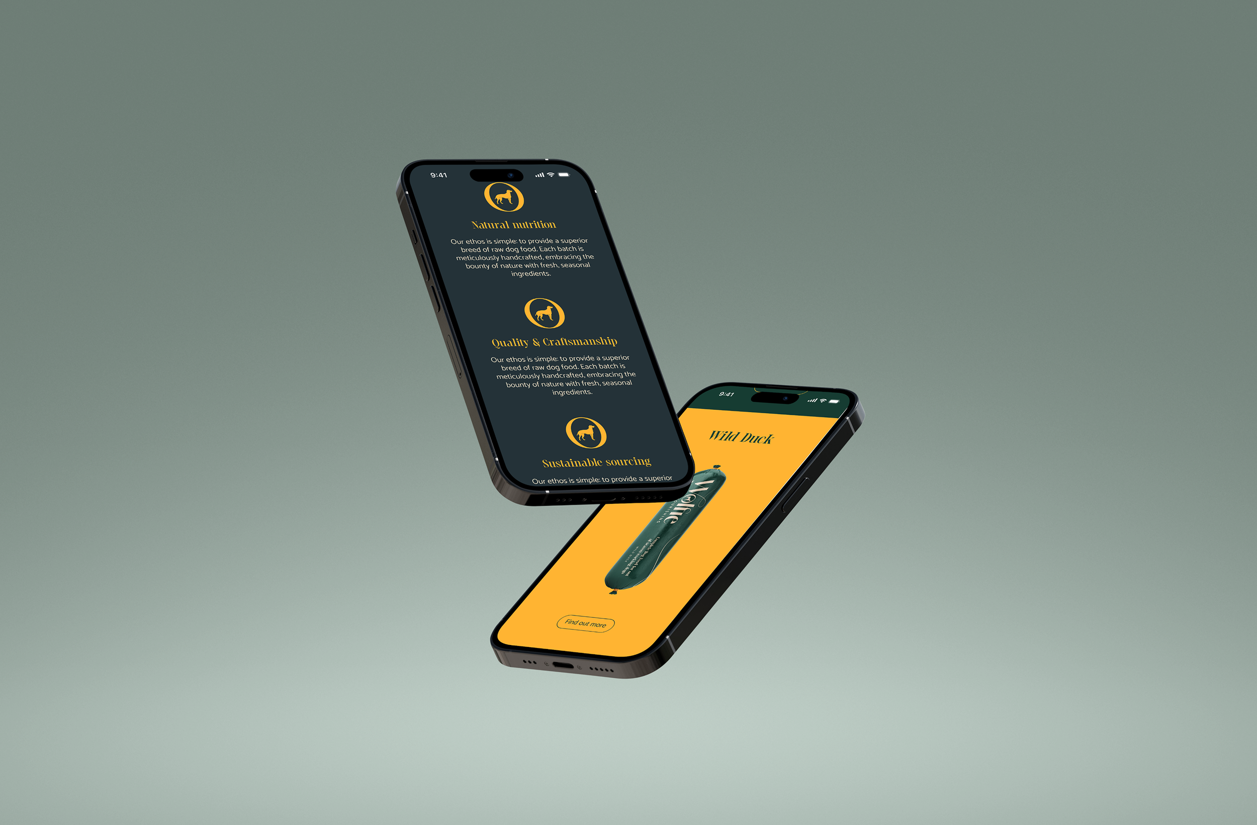
Wolfie
Website • UX
-
![Two smartphones displaying an art website by Freddy Paske, with a colorful painting of a bird and plants, set on concrete blocks with a blurred green leafy background.]()
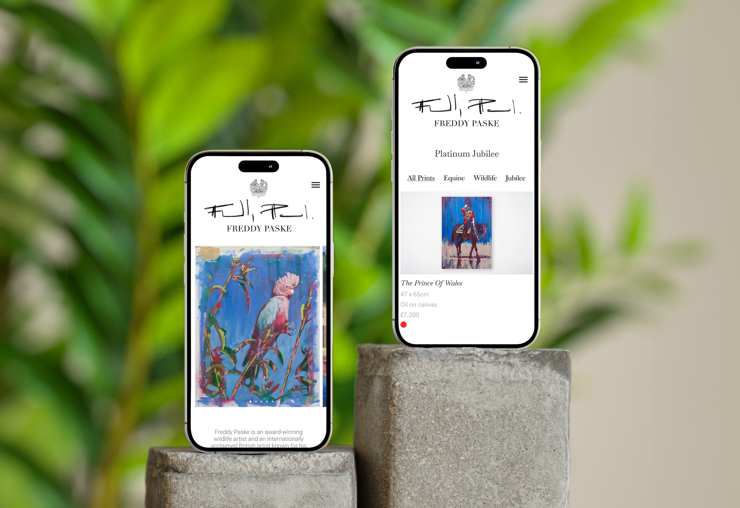
Freddy Paske
Website • UX
-
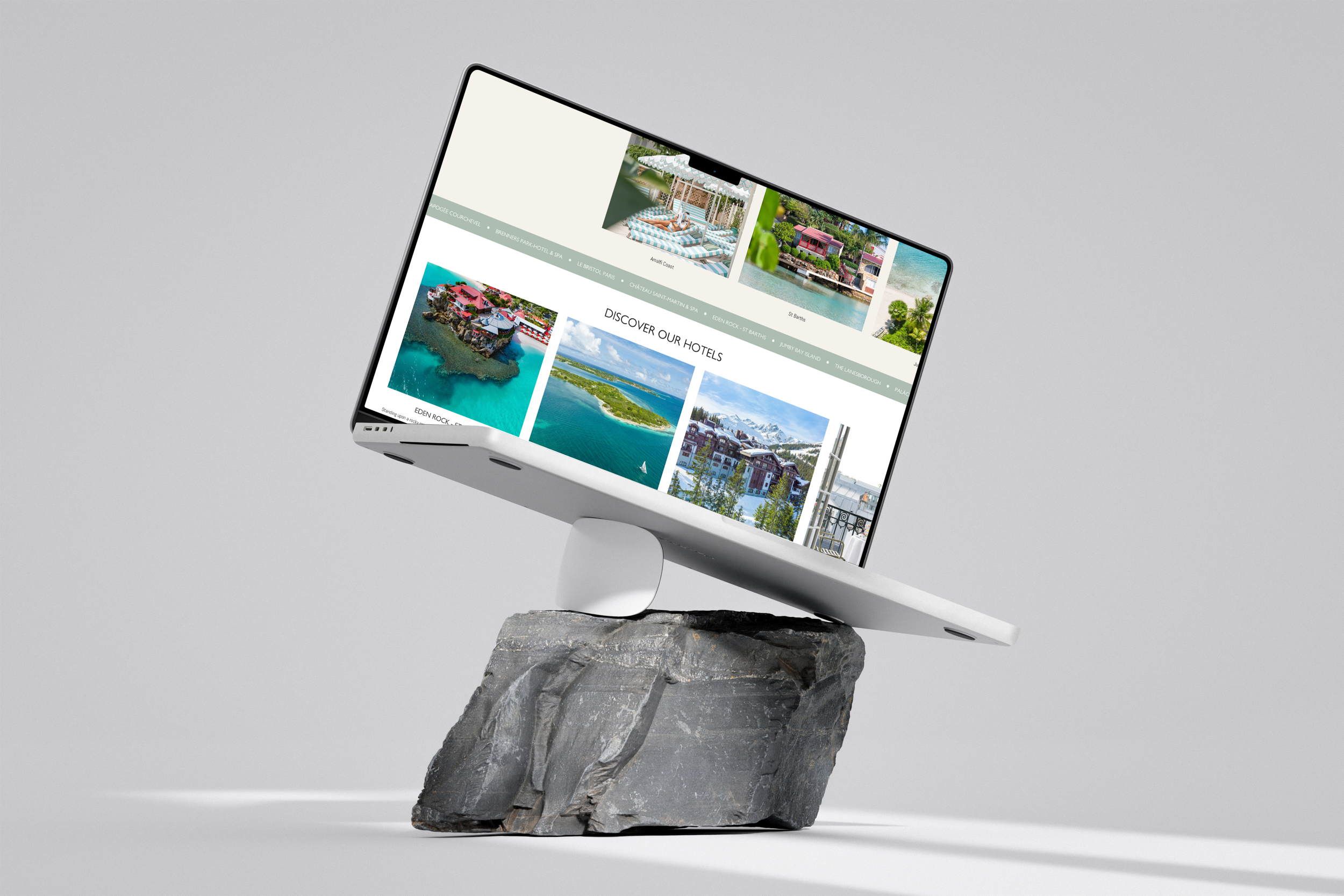
![A computer monitor displaying a travel website with images of hotels and tropical locations, placed on a large rock against a plain gray background.]()
Oetker Collection Boutique
Website • UX
-
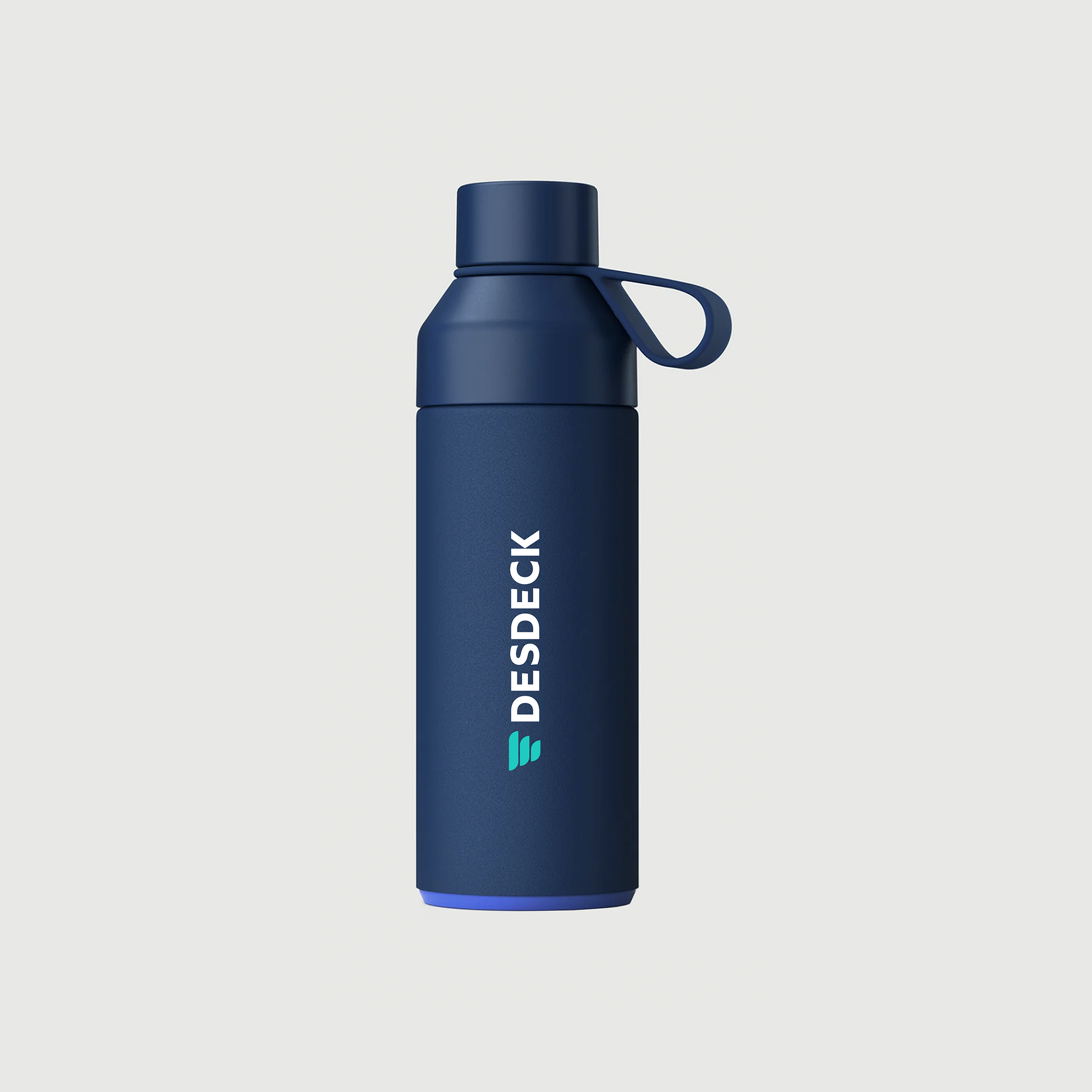
![A blue DESDECK branded insulated water bottle with a slanted screw cap and loop handle, standing against a plain background.]()
DesDeck brand
Branding • Website
-
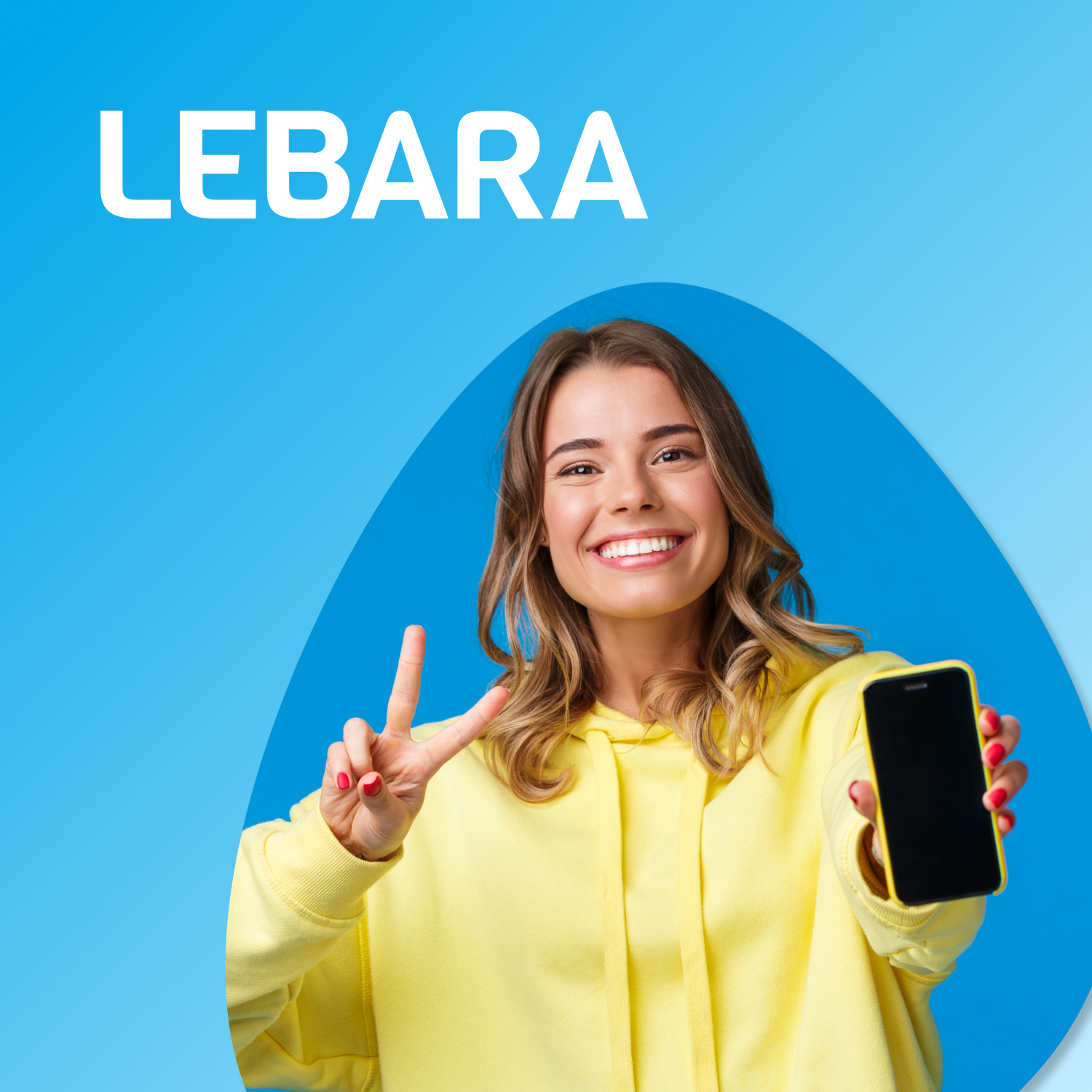
![Smile woman in yellow hoodie holding a phone with a black screen and showing a peace sign with her right hand. Blue background with the word "LEBARA" in white text.]()
Lebara
Social Media • Graphic Design